Same Image, Different Layout
Aspers Casino
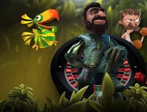
The page layout is dominated by a complex image inside an online casino floor. On the right a stylised knight is kneeling and an elephant is kicking a dice into the foreground. The viewer’s eyes are drawn to the left side of the frame. Here a tiger is raising its claws ready to pounce at the viewer. This creates a sense of immediacy, hopefully grabbing the web user’s undivided attention. The image also makes the eye move to the center of the screen. Here in white text is a promotional offer for free spins.
Below this offer is a yellow hyperlink where users can join the site. This graphic design is effective at making the viewer aware of the promotional offer and gives an ease of access if they want to take advantage of it. Above this colorful image is a banner containing the Aspers Casino logo and links to different games.
Each game is represented by minimalist white images on black background. When it comes to designing images it is useful to remember that simplicity is best. At the very top of the page is a search bar, login link and an option to join the site. There are therefore two “Join” links in close proximity to each other, both in bright yellow. This could be seen as ineffective graphic design. However when the purpose of the site is to convince a user to join it is useful to make the accessibility to application page as easy as possible.
When the user scrolls down they are greeted with colorful images of deal offers which dominate much of the page. To the right of these images there are smaller sized games to play. The graphic designer has determined that advertising the different deals is more important than giving easy to the actual games. Therefore they have given the deal pages greater visual emphasis.
Monster Casino
 This site uses the same images of the knight and pouncing tiger. However the layout is very different. Whereas in the Aspers page the tiger dominated the visual space, here these images are used as background props to give a variety of color. The background is a blurred jungle. Focus is given to to a large advertisement text for a deal in the center of the page. This text is in green (green and yellow being the main color scheme.) The deal offer text is animated, zooming in and out. This is a great example of how to utilize animation into the design of a web page.
The right side of the frame is dominated by a green cartoon mascot. This image contains a hyperlink which immediately sends users to a page of casino games. This is a useful way of giving users access to the games without having to fit them all onto the main homepage. On the left of the homepage screen is a vertical banner. The banner contains links to login or sign up to the site. These links are in white text in a green border. The shade of green is darker than other green shades on this page. This draws the eye to these links.
Clearly the main purpose of this page is to advertise deal offers and get users to sign up to the site. The rest of the vertical banner is in black text, meaning less emphasis is given. These are links to different games and promotions. Animation is again utilized below the main image. A scrolling text gives legal information. This animated text also contains an image of the mascot character, which is used to create a sense of brand identity.